Edwards & Higgins Plastering.
Our Approach
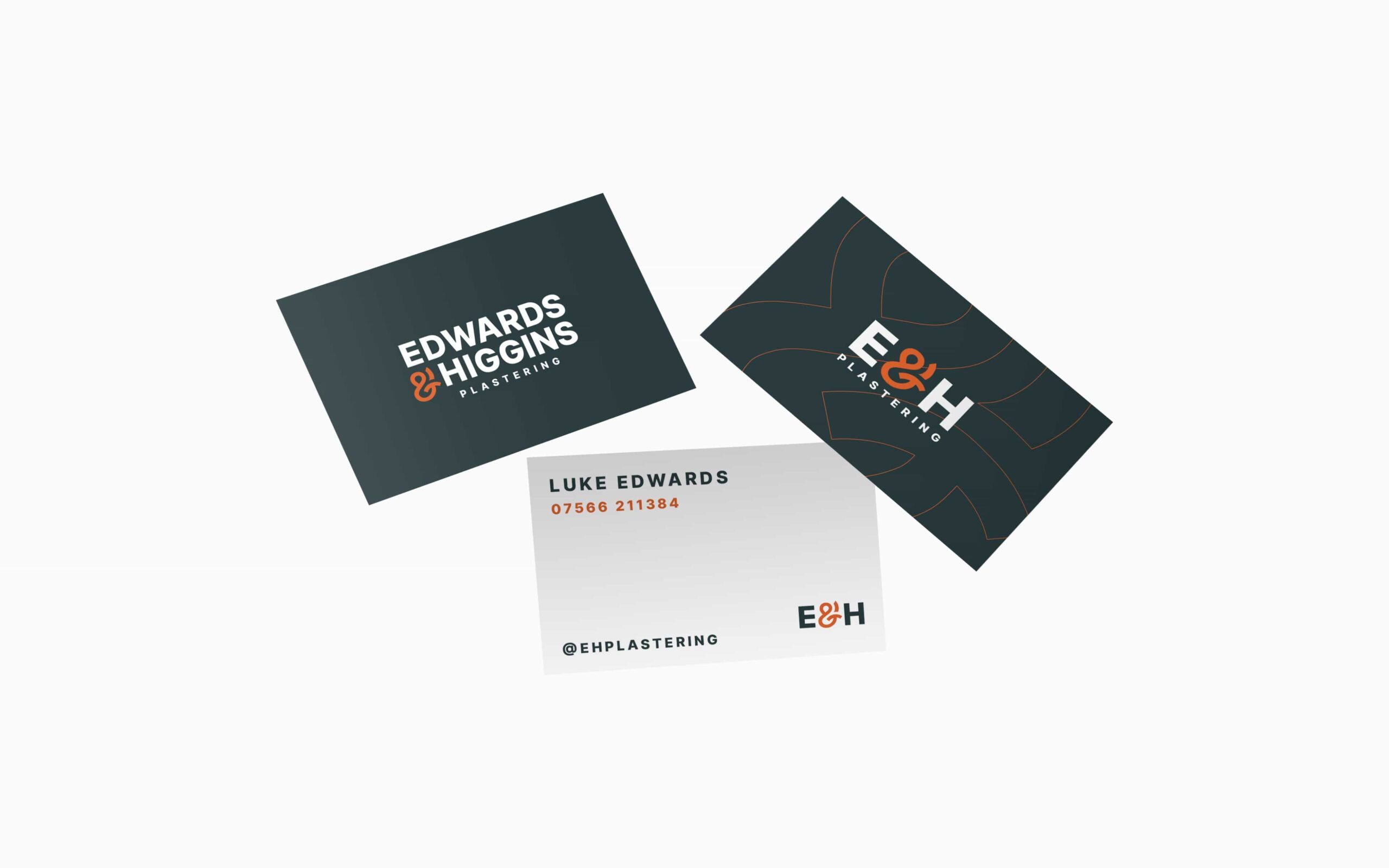
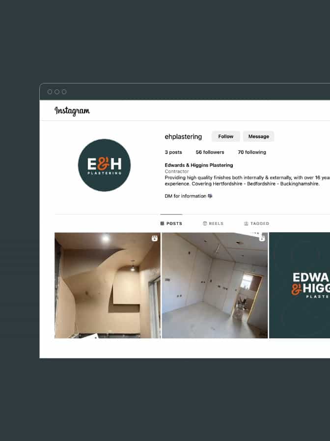
Playing into the hard-work that goes into plastering, the logomark showcases the craft behind the client’s capabilities. We explored an Ampersand being the logo touch that makes Edwards & Higgins Plastering standout from the competition. The Ampersand icon is intentionally a different colour for distinction, as well as slightly exaggerated without breaking the barriers of the container of the wordmark in its entirety.
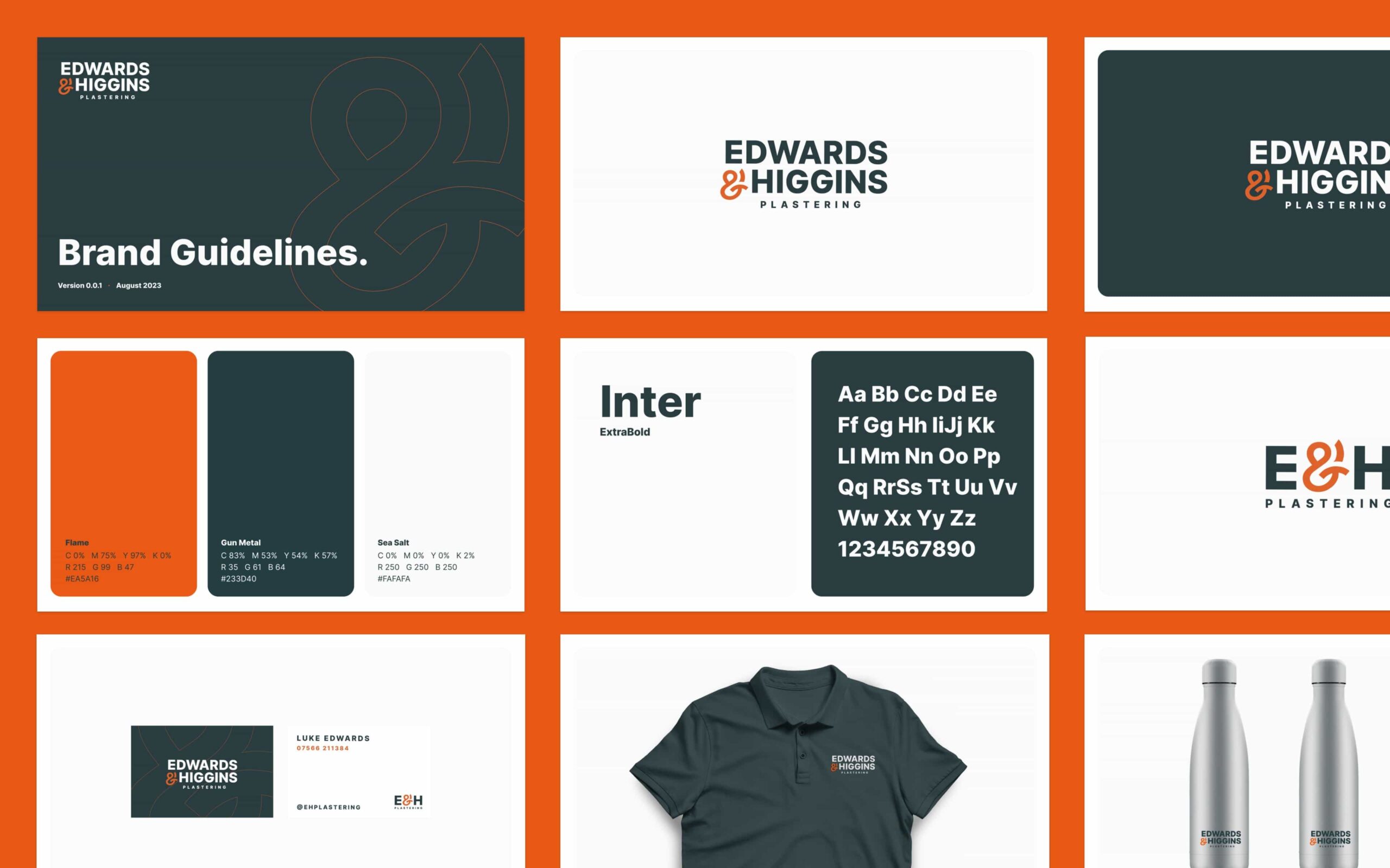
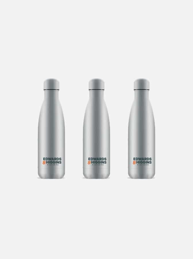
The logotype is a slightly stylised version of Inter. The strong & firm letterforms paired with the heavy weight leads to a logotype that feels secure and modern, reaffirming the reliability offered to their clients.


The Visual Identity

Our Delivery
Other Case Studies
Unlock your potential with a project consultation
No-one understands your business better than you, we’d love to hear about your brand and business challenges, even if you’re not sure what your next step is.
