Shire Sand & Gravel.
Brand Strategy
Product Design
Visual Identity
A fresh Rebranding Project for Shire Sand & Gravel, a traditional family-owned aggregates business in Lincolnshire, looking to expand & grow. The client approached us to elevate their already established brand, bringing it into alignment with modern industry needs and aspirations. With over 30 years of experience, Shire Sand & Gravel was ready to evolve, and we delivered a brand that embodies their legacy and future ambitions.
Our Approach
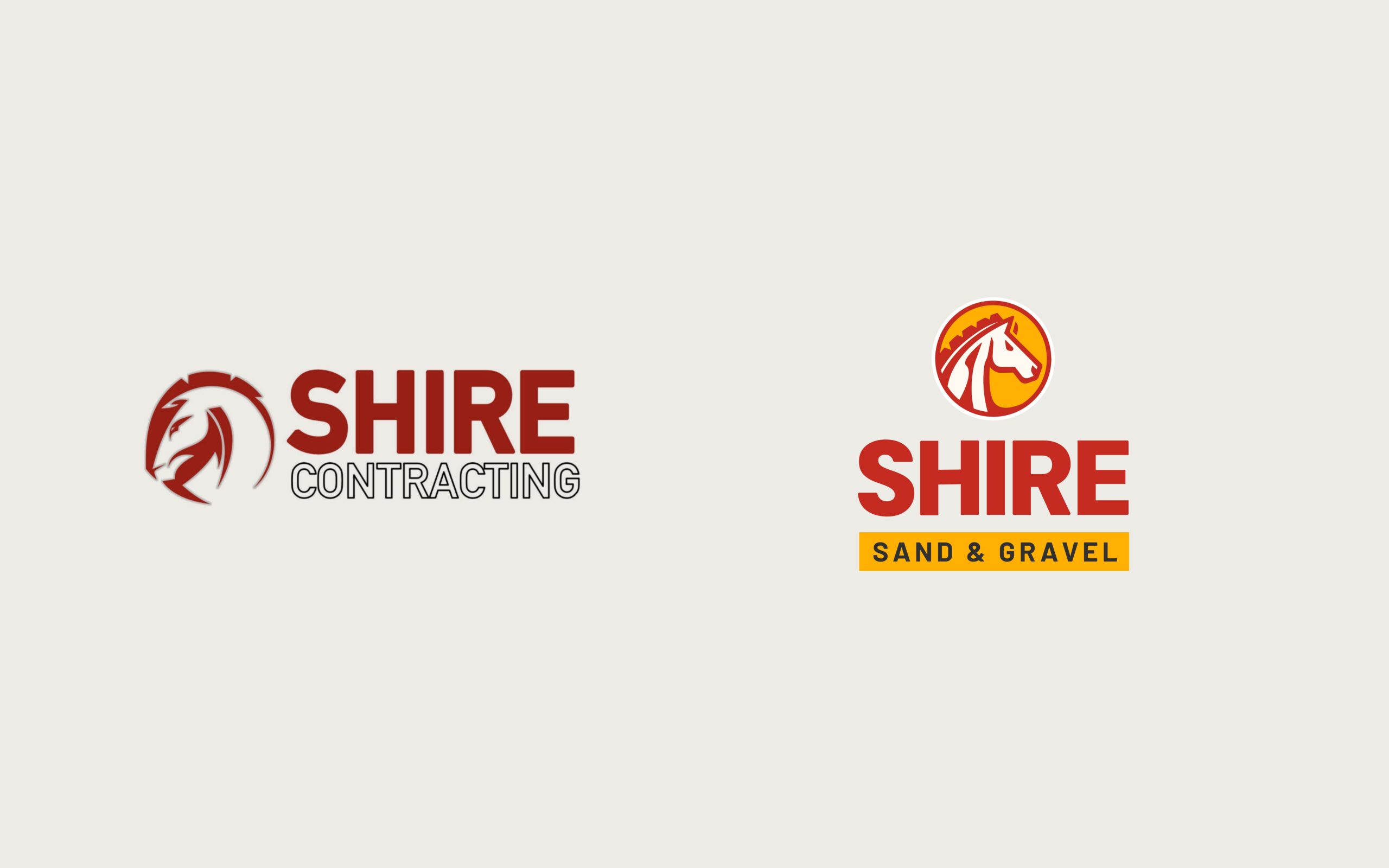
During our focused rebranding project with Shire Sand & Gravel, we uncovered fragmented brand representations across multiple channels. Our primary objective was to consolidate all livery and logos into a cohesive and visually compelling identity. Central to the client’s vision was preserving the strength and loyalty embodied by their iconic shire horse motif. Our challenge was to elevate and rejuvenate this emblematic symbol, imbuing it with renewed vitality and ensuring it became the cornerstone of a unified and impactful brand presence.

Our Delivery
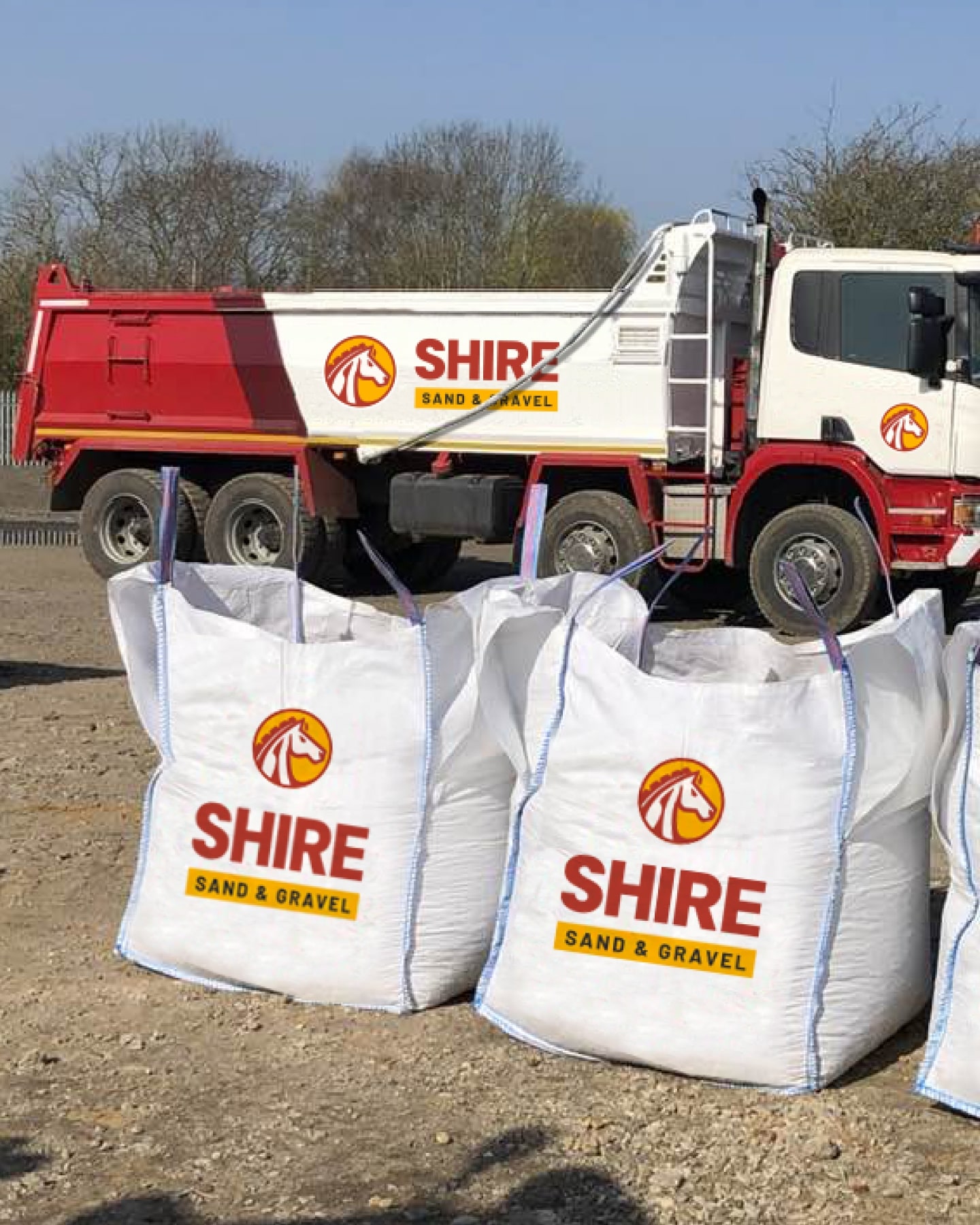
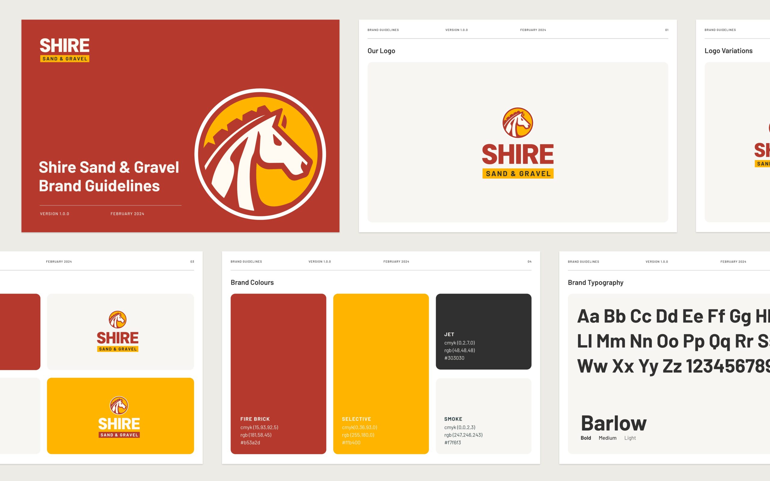
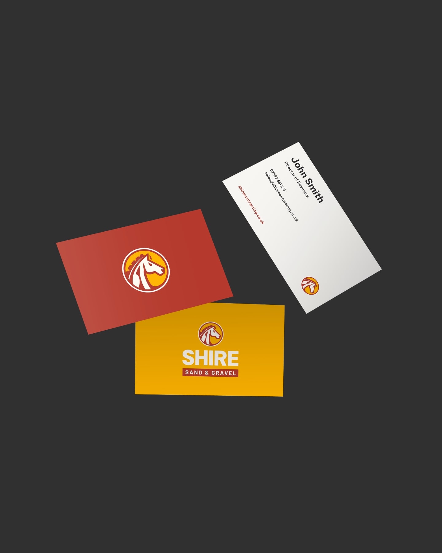
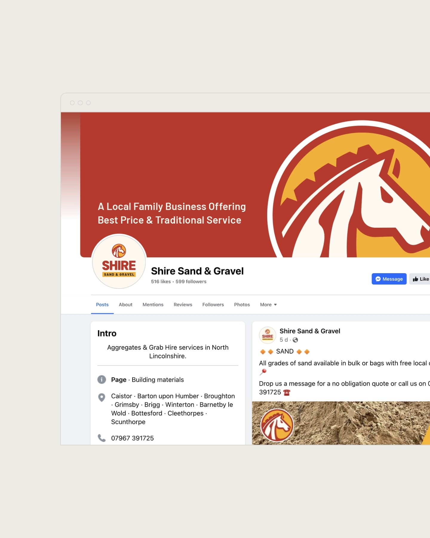
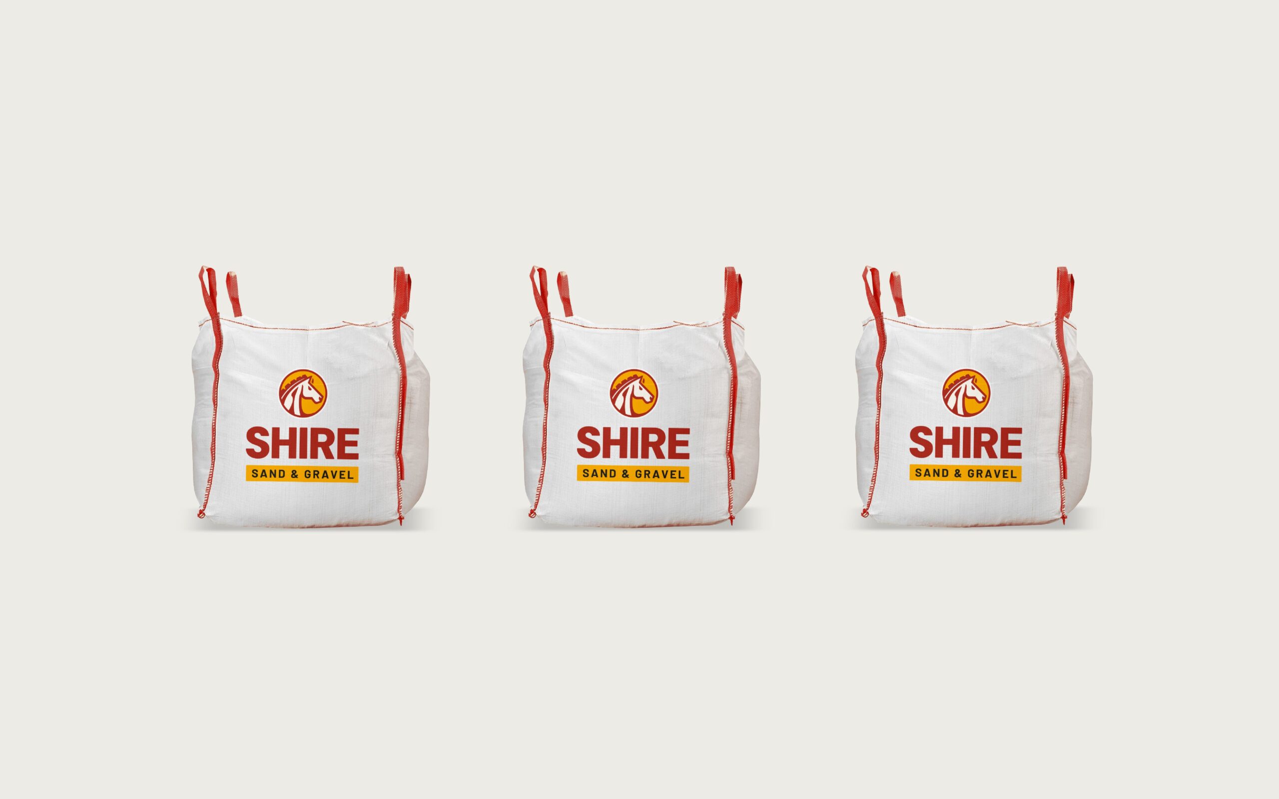
Shire engaged our services to implement their new brand across multiple platforms, including livery, bulk bags, business cards, and social media. We provided them with meticulously crafted brand guidelines, enabling them to effectively and consistently apply the brand assets we developed. This approach ensures a professional and cohesive visual identity across all communications and touchpoints.
Our Delivery
The client was thrilled with our design delivery, noting how well it aligned with their vision, connected authentically with their audience, and upheld their 30-year legacy with pride.
Other Case Studies
Unlock your potential with a project consultation
No-one understands your business better than you, we’d love to hear about your brand and business challenges, even if you’re not sure what your next step is.

