

Most people think cafe branding means the logo above the door. The logo matters, but it is maybe a tenth of the job. Someone walks in, waits, reads a menu, holds a cup, takes a card, pays, and then puts a photo of their lunch online. That is seven points of contact and the logo is barely one of them. If the other six look like they came from six different businesses, the brand is doing nothing, however nice the logo is.
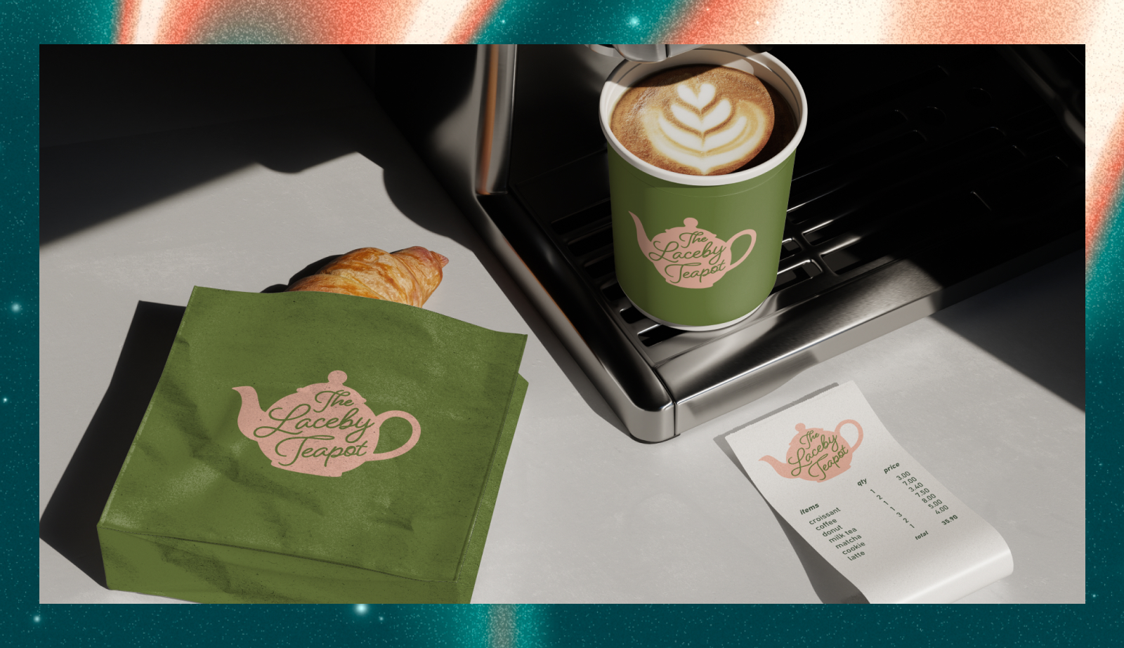
I have just finished a rebrand for The Laceby Teapot, a tea room outside Grimsby that has been open since 2012, and it is a fair illustration of where the money in cafe branding actually goes. Here is the order I would spend it in.
The logo has one job: survive being small.
Most cafe branding starts with a logo designed at the size of a sign and then used at the size of a stamp. The Laceby Teapot's old mark asked you to read three things at once - a teapot, a set of scrollwork flourishes, and the name split across two lines, one of which had so little contrast against the green that it practically vanished. Fine on a wall. Illegible on a loyalty card.
The test is simple. Print it at twenty millimetres wide and look at it from arm's length. If you cannot tell what it says, it will fail on a cup, a stamp, a sticker and a profile picture, which is where most people actually meet it. We rebuilt theirs as one shape with the name sitting inside the pot, so it reads at any size.
The menu is working harder than anything else you own.
A menu is not a list. It is the only piece of design a customer gives their full attention to, usually for two or three minutes, usually while deciding how much to spend. Most cafes treat it as an administrative document, print it on the nearest machine and laminate it.
Two things make an enormous difference. First, order - put what you want to sell where the eye lands, which is the top of a page and the top of each section. Second, how it is set, because a cramped menu reads as cheap and a menu with air around it reads as considered, and that happens before anyone has read a word.
If you reprint often because the kitchen changes, have it built so you can reprint it yourself. That is how I set up the menu and print design for the tea room - breakfast, lunch, afternoon tea and specials, all reprintable in house.
A takeaway cup is a billboard that walks down the high street.
A cup is the cheapest advertising in cafe branding and almost nobody uses it. Someone carries your name around town for twenty minutes, in public, at eye level, with an implicit recommendation attached. A plain white cup wastes that completely.
You do not need a full print run to start. A well-drawn stamp or a sticker on a plain cup does most of the work and costs very little. The same goes for napkins, bags and the paper band round a slice of cake.
Loyalty cards go in a wallet or in the bin, and the design decides which.
The ones that get kept feel like an object rather than a receipt. Thicker stock, a proper shape, something on the back worth looking at. The ones that get binned are thin, busy, and carry a grid of ten circles with nothing else to say.
It is a small cost with a measurable return, because every card sitting in a wallet is a reason to walk past one place and into yours.
The front door gets about three seconds.
People decide whether to come in from across the road, while they are still walking. That decision is made on the signage, the window, and whether the place looks open. Opening hours that are hard to read from the pavement cost you customers every day, and so does a chalkboard that has had the same thing on it since March.
If you are doing signage, do it at the same time as everything else. A sign made two years after the logo almost never matches it. That sits under signage and vehicle graphics.
Your Facebook page is the homepage now.
For most cafes, more people will see the Facebook or Instagram page than will ever see a website. It is where people check whether you are open, what the specials are, and whether the place looks like somewhere they would want to sit.
Which means the profile picture, the cover image and the way your posts look are brand assets, not afterthoughts. The Laceby Teapot's page carries the new mark now and it is the most-viewed piece of the whole project. If posting consistently is the bit you never get to, social media graphics built as templates solve most of it.
What goes wrong with cafe branding.
Doing the logo and stopping. The logo is the cheapest part and the least visible. The value is in everything it goes on.
Changing things one at a time as stock runs out. You end up with four years of slightly different versions in circulation at once, which reads as disorganised even to people who could not tell you why.
Copying a cafe two hundred miles away. It works there because of who walks past there. A rebrand should start with who actually comes through your door.
Where to start if the budget is tight.
Logo design and the rules for using it first, because everything else depends on it. Then the menu, because it is the thing people read. Then the cup and the loyalty card together, because they are cheap and they travel. Signage when you can, since it is the dearest item and the one that lasts longest.
Honest numbers, so you can plan rather than guess. Logo design is £450. A full brand identity is £1,250, which covers the logo suite, colours, typography and the guidelines. On the print side, a menu, flyer or poster is £120.
Cafe branding is not a project you have to do all at once. It is a project you have to do in the right order. Before you commit to a name, it is worth a free search of the trade mark register to be sure nobody else already owns it.
If you run a cafe, tea room or anywhere that serves food and you want help with cafe branding, you can see how I work with hospitality brands and food and drink businesses, or read The Laceby Teapot case study in full. For branding in Grimsby generally, the brief generator will give you an honest price in about ten minutes.
Based in Grimsby, we work with businesses across North East Lincolnshire.