

A designer sends you three routes. You open the PDF, something jumps out at you immediately, and then you sit there trying to work out whether that reaction means anything. Or worse, you like bits of all three and assume that makes you an awkward client.
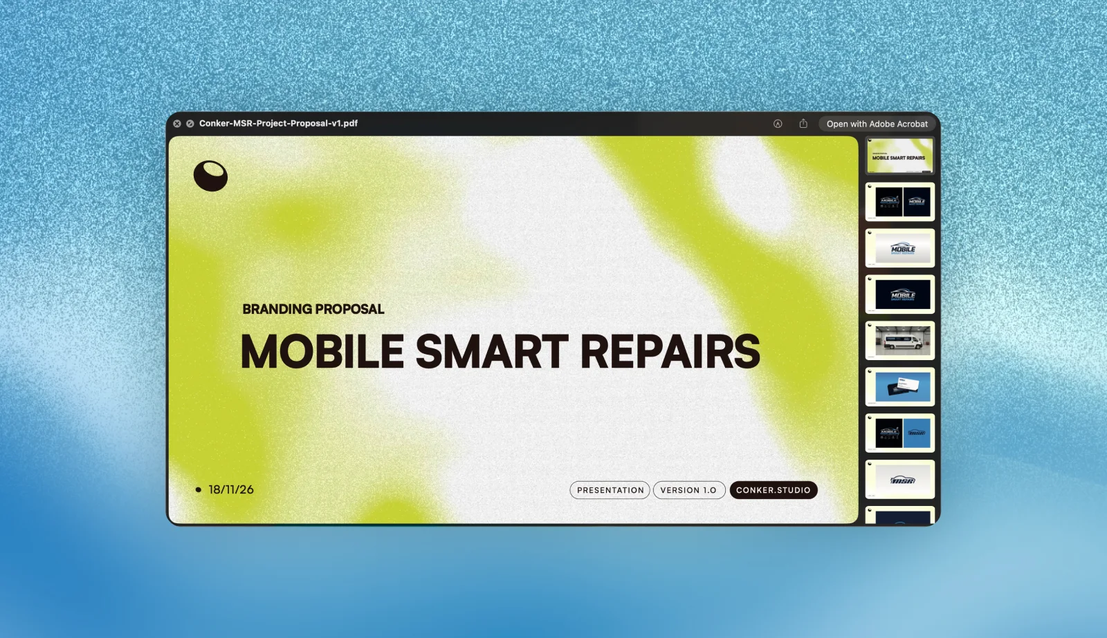
I send three logo concepts on every identity project, each one shown next to whatever the business is using now, with the downside of each written underneath it. Here is how to actually read them.
Three logo concepts are not three finished logos.
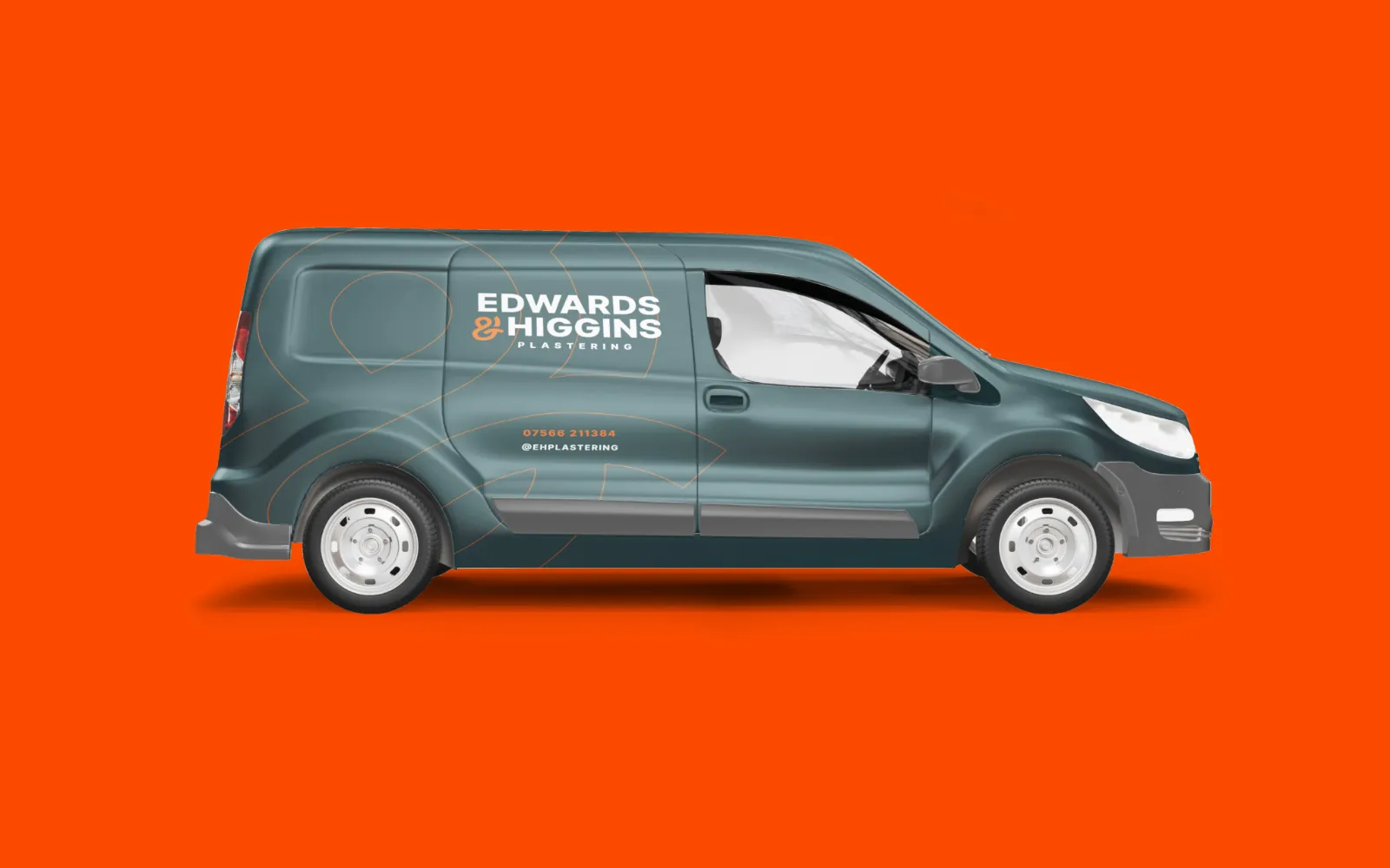
This is the bit that trips people up. Concepts are directions, not products. The colours will change, the lettering will change, the spacing is nowhere near final, and the phone number on the van mockup is a placeholder.
What you are judging in logo concepts is the idea underneath. Does this route say the right thing about the business? Could you live with it for ten years? Everything on top of that is adjustable, and most of it will be adjusted.
If you find yourself rejecting a route because of the shade of blue, stop and ask whether you are rejecting the route or the blue.
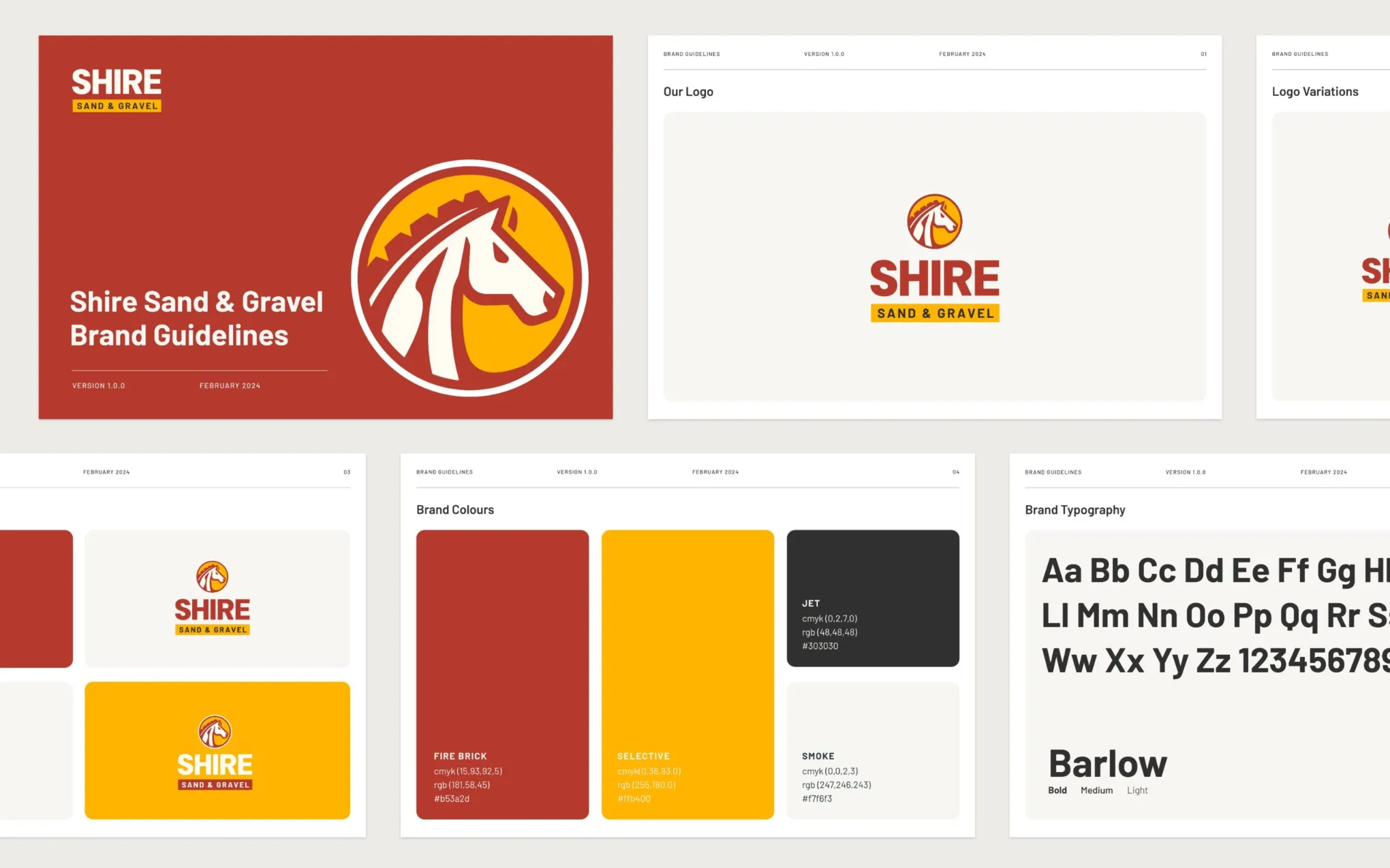
The safe one wins by default, and that is the problem.
Show anybody three logo concepts and they will gravitate towards the most familiar one. It feels less risky because it looks like things they have already seen, and things they have already seen are, by definition, what your competitors are using.
That does not make the safe route wrong. Sometimes it is exactly right, and a business that needs to be understood in two seconds from a passing car has good reason to pick it. But pick it because you decided to, not because it was the one that felt least frightening on first look.
Ask yourself which route you would be happiest explaining to someone in a year.
Ask what the downside of each one is.
Every route has a trade-off. The distinctive one is harder to read at a glance. The literal one looks like everyone else. The monogram is brilliant on a polo shirt and meaningless until people learn what the letters stand for.
A designer who has thought their logo concepts through can tell you the weakness of their own work without being asked. If all three come with nothing but upside, either they have not stress-tested them or they are selling rather than advising.
This is the single most useful question you can ask, and it costs nothing.
Judge logo concepts where they will actually live.
Logo concepts look good on a dark background at 400% on a laptop. That is not where they work for a living.
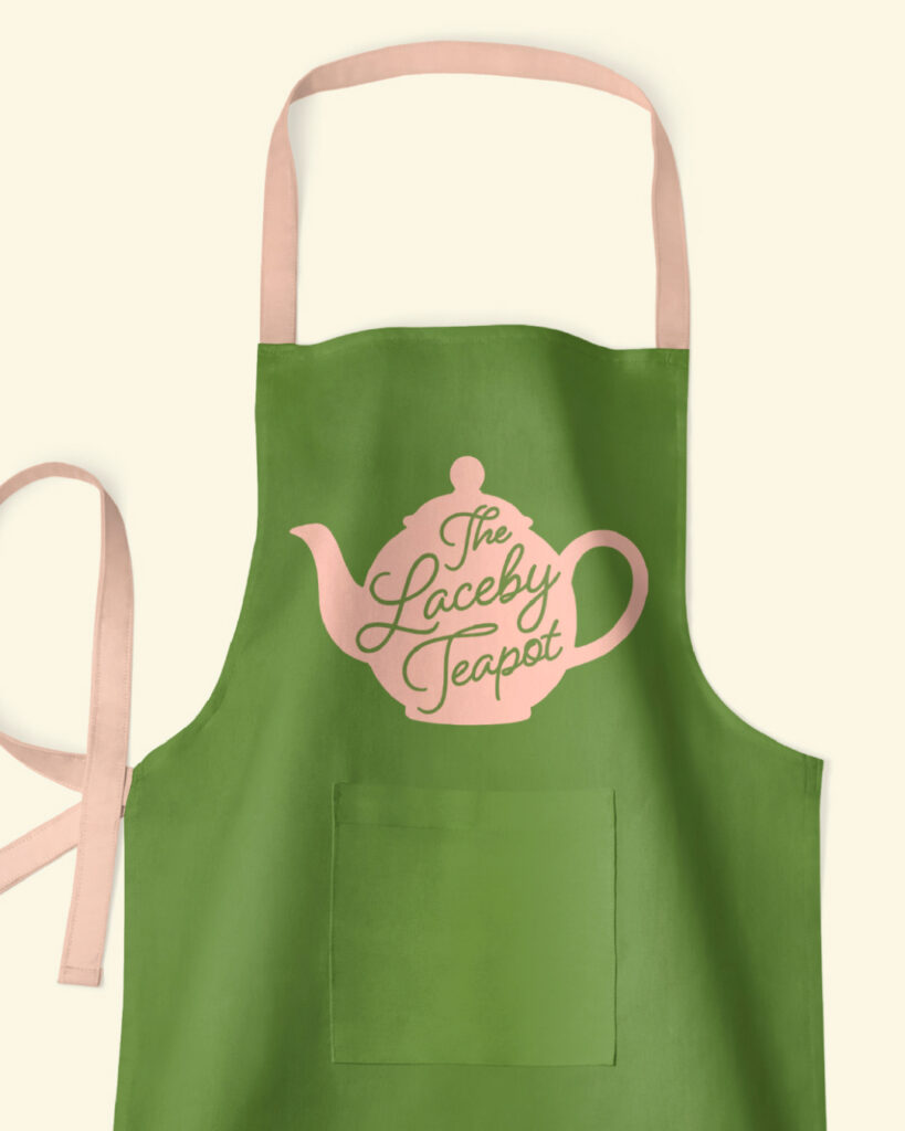
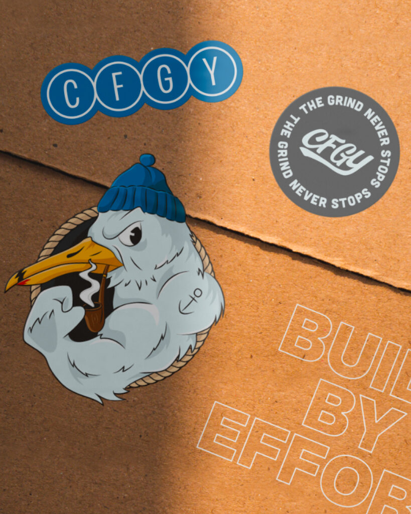
Ask to see it small. Ask to see it in one colour. Ask to see it embroidered, because thread cannot do fine detail and a lot of gradients die on a polo shirt. If a van is the main thing people will see, judge it on the van and nowhere else.
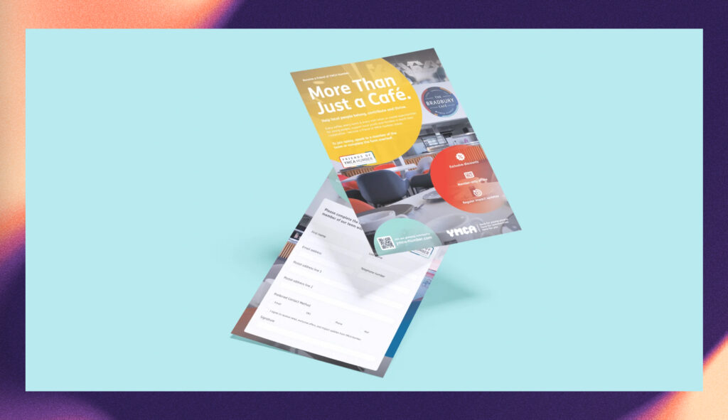
I put every route onto the things the business actually uses for exactly this reason. It changes which one you pick more often than you would expect.
Liking bits of two is the right answer more often than not.
People apologise for this. There is nothing to apologise for.
The strongest final identity is frequently built from two of the logo concepts - the structure of one with the lettering of another, or the confidence of the bold route with the clarity of the simple one. That outcome only happens if you say so out loud, and plenty of clients do not, because they think picking one cleanly is what they are supposed to do.
You are not sitting an exam. Tell the designer what is working in each and let them do the stitching.
Say what you do not like, specifically.
I am not sure about it gives a designer nothing. The letters feel too tight, or it looks like a garage rather than a workshop, gives them somewhere to go.
You do not need design vocabulary for this. Describing the feeling is enough, as long as you point at the thing causing it. What does it remind you of? Who does it look like it belongs to? What were you expecting to feel that you did not?
Negative feedback is not rude here. It is the entire job.
Do not ask your whole family.
Fifteen opinions on three logo concepts produce an average, and an average logo is a forgettable one. Everybody has a favourite colour and everybody will tell you about it.
Ask two or three people who resemble your actual customers, and ask them a better question than which one do you like. Try what sort of business does this look like, and see whether the answer matches what you do. That tells you something. A vote does not.
Seven questions worth asking.
What is the weakness of each route?
How does this look at the size it will usually be seen?
Does it still work in one colour?
What does this say about my business to somebody who has never heard of me?
Is anything here too close to a competitor?
Has anybody checked whether a similar mark is already registered? You can search the register yourself through the Intellectual Property Office.
If I pick this today, will I still be comfortable with it in five years?
How I present logo concepts.
Three logo concepts, every time, each shown against what the business is using now so you can see exactly what changes. The downside of each one written into the proposal, not hidden until you ask.
Nothing in that first round is final, and nobody is expected to pick cleanly. I would far rather hear the second one, but with the lettering from the third, than a polite yes to something you are not sure about.
If you want to see how that plays out, the work page has the finished versions. I have also written about what a logo actually costs, what you should own when you pay for one, and how I approach brand identity.
Based in Grimsby, we work with businesses across North East Lincolnshire.