

Most charity brands were never designed. They accumulated - a logo a volunteer made years ago, leaflets that each look like they belong to a different organisation, a website nobody can update without ringing someone, and a Facebook page quietly doing most of the actual work. That is nobody’s fault. Every hour spent on design is an hour not spent on the thing you exist to do. But it costs you anyway, in funding bids that look thin next to better-presented ones and in people who needed you and scrolled past. Here is what I would spend a small charity branding budget on, in what order, and why.
Trust is the whole job.
A business brand can get away with being interesting. A charity brand has to be believable first.
Think about who is actually looking. Someone deciding whether to donate. A parent working out whether to send their son along on a Friday night. A funding panel with eleven applications and an afternoon to get through them. Every one of them is making the same private judgement - are these people competent, and are they safe? - and they are making it in about two seconds, mostly on how you look.
That is an uncomfortable thing to accept when the quality of the work itself is not in question. But a brand that looks neglected reads as an organisation that is neglected, however untrue that is. Looking like you have your house in order is not vanity. It is the price of being taken seriously.
You are never talking to one person.
This is what makes charity work genuinely harder than commercial work, and it is why charity branding so often falls apart.
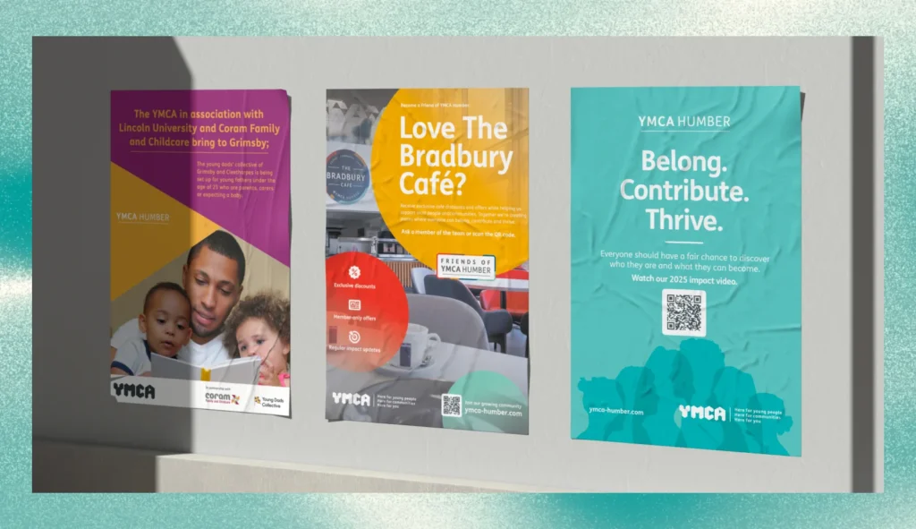
YMCA Humber has been part of Grimsby since 1882 - supported housing, youth work, family services and a community café, all under one roof. On any given week the same brand has to speak to a young person looking for somewhere to live, a parent joining the Young Dads Collective, a prospective trustee reading a recruitment booklet, and a local business deciding whether to become a Friend. Those are four completely different registers.
The answer is not one tone of voice. It is a system flexible enough to shift - bold shapes and confident colour that can be approachable on a leaflet for new dads and composed on a trustee booklet, without ever stopping looking like the same organisation. That is what brand guidelines are for, and it is why they matter more for a charity than for most businesses.
Spend the first money on what people actually touch.
The commonest mistake I see is a charity spending its entire budget on a logo and having nothing left for the things that do the work.
Threshold Youth Club meets on Friday evenings - toast and hot chocolate, pool, table tennis, music. The club had the welcome sorted. What it needed was a way to get young people through the door in the first place. So the budget went on a print set built for exactly that job: posters for the hall, a pavement A-board for club nights, a window display, and branded cups and wristbands, every piece carrying a QR code straight to the sign-up form.
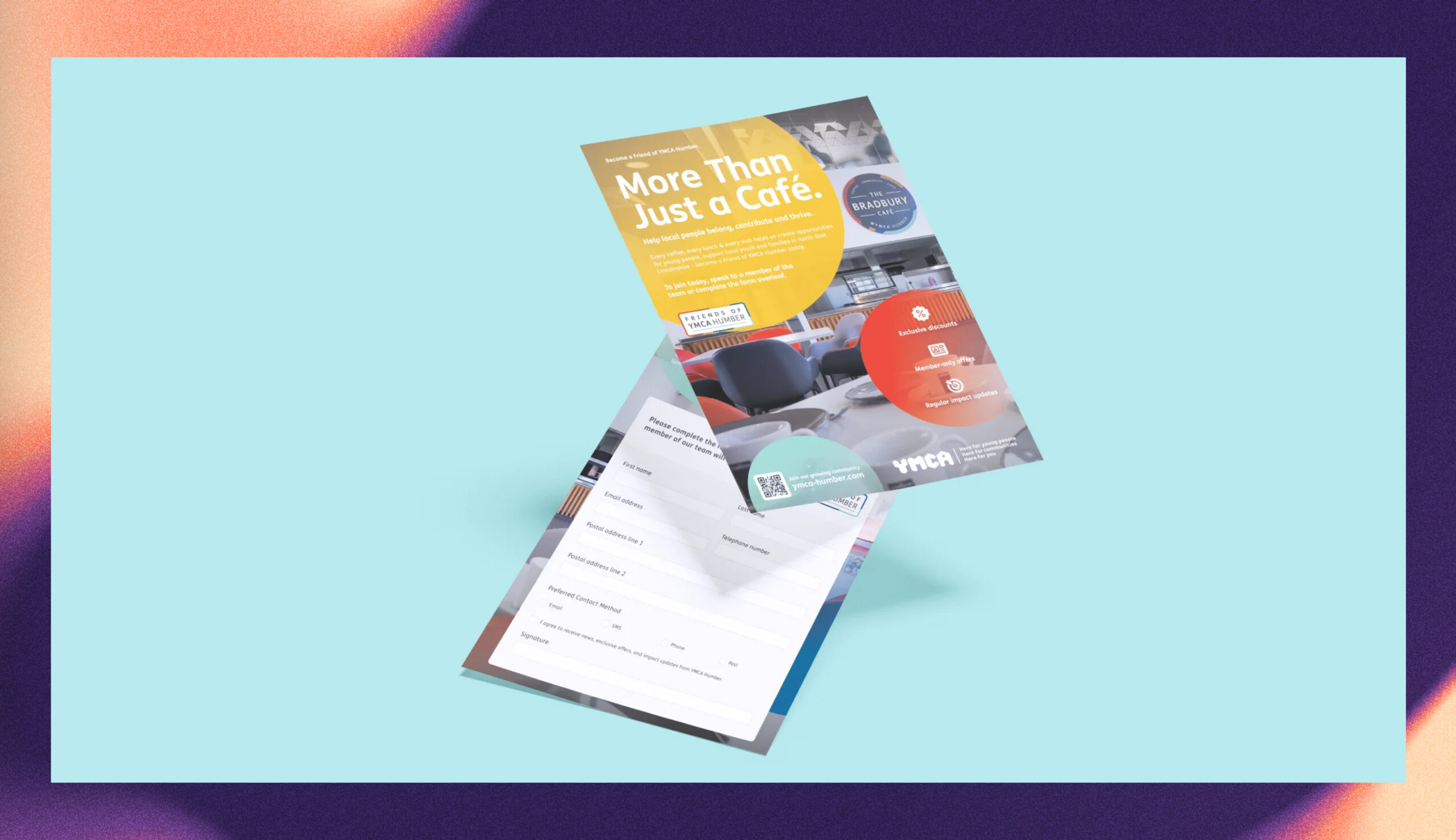
The small pieces matter more than they sound. A cup on a Friday night and a wristband that turns up at school on Monday are how the next conversation starts. A logo sitting in a folder has never persuaded anyone of anything. So identity first, yes, but only as much as you need - then put the rest into print, signage and the materials people physically pick up.
Design it for whoever is using it on a wet Tuesday.
Your brand will not be applied by a designer. It will be applied by a part-time coordinator making a poster for Saturday’s bag pack, or a volunteer putting something on Facebook at nine at night.
If using the brand correctly requires skill, software or permission, it will not get used. You will have beautiful guidelines and a Facebook page that looks nothing like them.
This is why social media templates are usually a better investment for a charity than another printed item. Six editable templates mean your team can post consistently all year without a designer on hand. The same goes for a website - if updating it means raising a ticket with someone, your news page will still say 2024 on it next spring.
Accessibility is not a nice-to-have in this sector.
Most charity audiences include people that commercial brands quietly design past - people with low vision, low literacy, English as a second language, or a phone three generations old on a poor connection.
Readable type at a sensible size. Colour combinations with genuine contrast, not just ones that look good on your screen. Plain language instead of sector vocabulary. Alt text that says something. A website that works on a cheap Android in a waiting room. None of this costs more to do. It only costs more to retrofit.
What it actually costs.
Honest numbers, so you can plan rather than guess.
Logo design is £450, which covers a discovery questionnaire, two concepts, two rounds of revisions and a full file pack for print, web and single colour.
A brand identity is £1,250 - logo suite, colour palette, typography, a six-page brand guide, business card design and three social templates.
A full brand or rebrand starts at £2,500, with a strategy workshop, twenty-page guidelines, stationery or signage and launch assets.
On the print side, a flyer or poster is £120, and a booklet or impact report starts at £450 for up to eight pages, then £60 for each extra page. A social template pack is £250. There is no VAT to add, and every project gets a fixed quote in writing before any work starts.
If the budget is almost nothing, do this.
Pick the three things the most people see. For most small charities that is a poster, a Facebook post and whatever is on the door.
Make those three consistent - same logo file, same two colours, same typeface, every time. Not perfect. Consistent. Consistency is most of what people read as professionalism, and it is free once someone has decided what the rules are. Then add to it when funding allows, in the order the people you serve will notice.
One last thing worth saying.
Charities are often apologetic about spending money on design, as though it were taken from frontline work. I would put it the other way round. A clearer brand wins more funding, recruits more volunteers and reaches more of the people who need you. Done properly, it does not compete with the work. It is what makes more of the work possible.
If you want to talk it through, the charity branding page sets out how I work with charities and community groups, and the brief generator will get you to an accurate quote in about ten minutes.
Based in Grimsby, working with businesses across North East Lincolnshire.