

Good van livery in Grimsby does one job: it gets you calls from people who saw your van and remembered who you are. If you're a trade, your van is probably your hardest-working advert. It sits on driveways all day, waits at the lights on Peaks Parkway and parks up outside every job you do.
Most vans waste their best advertising space.
The logo is squeezed onto a door, the list of services runs to twelve lines and the phone number is too small to read from the pavement. Here are the five rules I follow when I design van livery and vehicle graphics, plus a real example from a local plastering firm.
1. Make your van livery readable in three seconds.
Most people see your van for a few seconds at most, often while they're driving. Good van livery gives them three things in that time: who you are, what you do and how to reach you. Your name should be the biggest thing on the side, your trade should sit right under it in plain words, and your phone number or web address should be big enough to read from across the road.
Pick a bold, simple typeface and keep strong contrast between the lettering and the van colour. Thin script fonts and pale text on a white van disappear as soon as it moves.
2. Say less than you think you need to.
It's tempting to list every service you offer, but a list of twelve things reads as none of them. Pick the one line that sums you up, such as "Plastering & Rendering", and let your website or Google Business Profile do the rest. One clear message gets remembered. A paragraph gets ignored.
3. Make it match the rest of your brand.
Your van livery shouldn't look like it belongs to a different company from your workwear, your quotes and your website. When the colours, logo and type are the same everywhere, people start to recognise you before they've even read your name. That recognition is what turns "I've seen that van about" into a phone call.
If you don't have a proper brand yet, sort that first. Lettering a van with a logo you're about to change means paying for vehicle graphics twice. My page on branding for trades explains how I build a brand that works on site as well as on screen, and my page on branding in Grimsby covers the wider process.
4. Design it for the van, not for a screen.
A livery that looks great as a flat drawing can fall apart on the real vehicle. Door handles, panel seams, ribbed sections, sliding-door gaps and rear windows all break up the design. I always work from the manufacturer's template for your exact make, model and wheelbase, so your name never ends up split across a door or your number sits under a handle.
Think about every side, too. The back of the van is what drivers stare at in traffic, so it needs your name and number as much as the sides do. The bonnet and front are usually best kept simple.
5. Choose the right van livery finish for your budget.
There are two main ways to brand a van, and both can look sharp. Cut vinyl graphics are letters and shapes applied straight onto your van's own paint. They cost less, suit a bold, simple design and are easy to update later. A full or part wrap covers large areas in printed film, so you can use colour, images and patterns. It costs more but turns the whole van into your brand, and it protects the paintwork underneath.
Either way, the design is what makes it work. I supply print-ready artwork to whichever sign maker or fitter you trust, with prices for signage and vehicle graphics starting from £200. Fitting is quoted separately by your fitter, so it's worth getting two or three quotes.
A local example: Edwards & Higgins Plastering.
Edwards & Higgins are a plastering team who take real pride in a clean finish, but nothing tied their vans, workwear and paperwork together. Their work deserved more recognition than their branding was getting them.
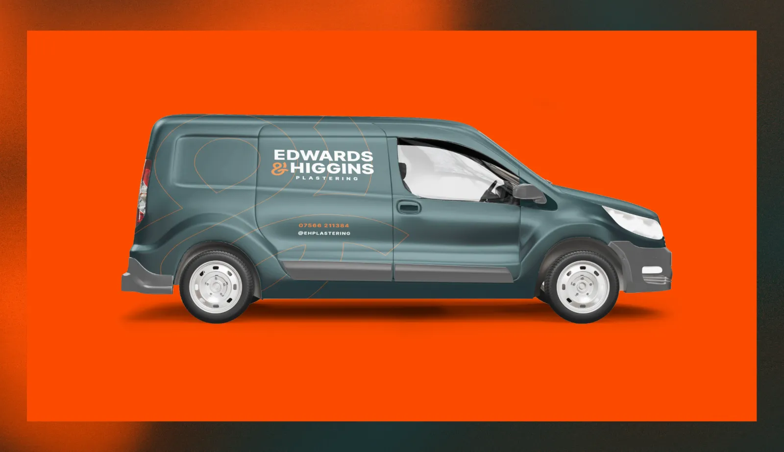
I built them a brand around an ampersand that works as a monogram, with a bold, no-nonsense typeface and a palette of deep slate and plaster orange. On the van, the wordmark sits large and clear on the side, the trade and phone number sit underneath and the orange ampersand gives the van a shape people remember. The same look carries onto their polos, business cards and merch. You can see the full project in my Edwards & Higgins case study.
The van livery mistakes I see most around Grimsby.
A phone number you can't read. If it's smaller than your hand, it's too small. Too many fonts and colours. Two fonts and two or three colours is plenty. Every service listed. Lead with your trade and let your website explain the rest.
Social icons with no handles. A Facebook logo on its own tells nobody where to find you. A fleet that doesn't match. Vans lettered at different times by different firms make you look smaller, not bigger. An old logo after a rebrand. Update the vans when you update everything else, or the old look hangs around for years.
If your van livery isn't bringing in calls, or you've just rebranded and the vans haven't caught up, I'd love to help. Tell me your van's make and model and what you do, and I'll come back with a clear, fixed price for the artwork - no hard sell. You can see all my prices in my free pricing guide, or start a project whenever you're ready.
Based in Grimsby, working with businesses across North East Lincolnshire.